How to Create a Design System
by Sarah Yukino Nakada ⦁ Dec 16, 2023
-
Colors

-
Color System
- RGB: It’s used by computers/screens, use it if you’re a developer/designer.
- CMYK or RYB: It’s used for paints, use it for ink.
-
Properties
- Hue: Red, Magenta, Blue, Cyan, Green, Yellow (temperature).
- Value: How dark (shaded) or bright (tinted) a color is.
- Saturation: The intensity of the color from vivid to grayish (toned).
-
Color Scheme:
- Monochromatic: Used for minimal and less distracting designs.
- Analogous: Colors next to each other on the color wheel.
- Complimentary: Colors on the opposite side of the color wheel.
- Split-Complimentary: One primary color and two secondaries on the opposite side.
- Triadic: Forms a triangle on the color wheel.
-
Color Psychology
- Yellow: Joy, Optimism, Fresh.
- Orange: Warmth, Enthusiasm, Creativity.
- Red: Passion, Power, Danger.
- Purple: Royal, Luxury, Wisdom.
- Blue: Trust, Confidence, Calm.
- Green: Nature, Safety, Balance.
-
Color Categories
- Fluorescent Tones: Extremely saturated and tinted colors. S: 100-63, V: 100-82.
- Neutral Tones: Extremely desaturated and tinted colors. S: 1-10, V: 99-70.
- Earth Tones: Moderate saturation and shaded. S: 36-41, V: 77-36.
- Pastel Tones: Low saturation and tinted colors. S: 14-21, V: 89-96.
- Jewel Tones: Highly saturated and tinted. S: 83-73, V: 76-56.
- Shades: Black and White. S: 0, V: 100-0.
-
The 60/30/10 Rule
- The distribution of colors throughout the design should be 60% Primary color, 30% Secondary color and 10% Accent color. In case you have more colors with the same role then divide the percentages equally in respect to each role.
-
-
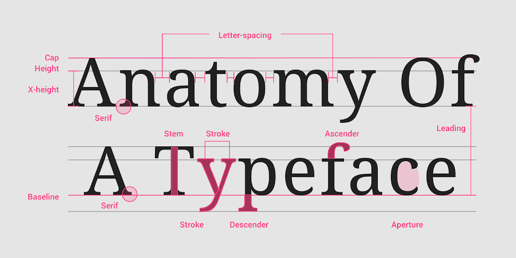
Typography
-
Properties
- Serif: A small stroke at the beginning or the end of the stroke on the letter.
- Weight: Thin, Extra Light, Light, Regular, Medium, Semi Bold, Bold, Extra Bold, Black.
- Style: Angled, true italics letters a, f, and g, are much different than non-italics.
- Letter Spacing: Space between letters, also known as tracking.
- X-height: The height of the lowercase in proportion to the uppercase letter.
- Character Width: Average, Condensed, Extended.
- Stroke Contrast: The difference between the thicker and thinner strokes.
-
Classification
- Serif: Has serif, Old Style, Transitional, Neoclassic, Slab.
- Sans Serif: Does not have serif, Grostesque, Humanist, Geometric.
- Handwriting: Mimics handwritten, Blackletter, Script, Handwriting.
- Display: Great diversity, decorative, only works with large point sizes.
- Monospace: All letters have the same width, no letterspacing, used for code.
-
Legibility
- The line height (spacing or leading) should be between 1.15 and 1.50 times the font size.
Bigger for smaller fonts and smaller for big fonts (display). - The letter spacing should be bigger for smaller fonts and smaller for bigger fonts.
- The paragraph spacing should be between 0.75 and 1.25 times the font size.
- Line length should be between 45 and 70 characters.
- More x-height makes it more legible, around 80%.
- More stroke contrast is more difficult to read.
- The average character width is easier to read.
- Sentence case is easier to read.
- The line height (spacing or leading) should be between 1.15 and 1.50 times the font size.
-